The Ultimate Free Responsive Checker Tools: Test Your Website on All Devices (2026 Edition)
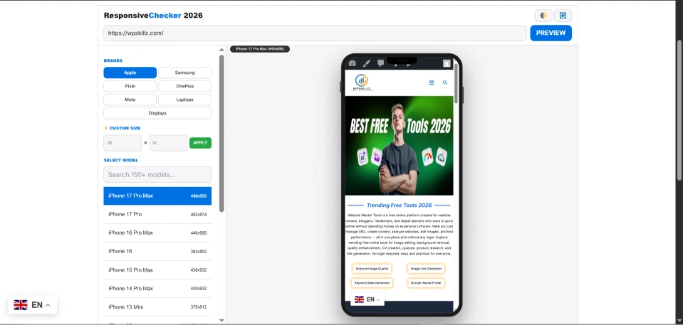
Quick Solution: Looking to test your site right now? [Scroll to the Top Search Bar], paste your URL, and select a device from our 100+ updated models. No login, no wait, 100% free!
⚠️ My Personal Experience
How are you, brother? Okay, this is my personal experience. I have improved a lot in my development and SEO phase by using this tool. This tool has helped me so much that earlier, when I had some USA and UK clients who wanted to check the website responsiveness, they would check it for iPhones specifically. With the help of this tool, I got the option to check the responsiveness for iPhones for every device. Apart from this, there is also the option to add custom width and height to it, in which we can check the responsiveness by adding width and height as per our choice.
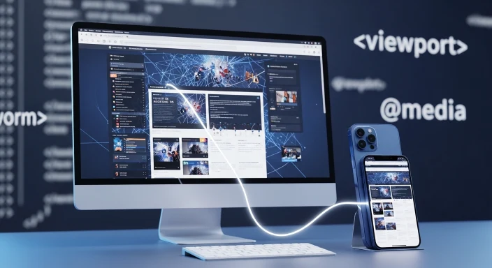
Have you ever spent hours coding a beautiful layout, only to realize it looks broken on a client’s iPhone? It’s a nightmare. In 2026, a website that isn’t mobile-friendly isn’t just “bad”—it’s invisible to Google. Over 65% of global traffic is mobile, and Google’s Mobile-First Indexing means if your viewport isn’t perfect, you won’t rank.
I’m Waseem, and after building hundreds of WordPress sites, I realized that developers need a responsive design checker tool that is fast, accurate, and includes the latest 2025-2026 hardware like the iPhone 17 and Samsung S26. That is why we built the WP Skillz Responsive Checker.
Why This is the #1 Tool to Check Responsiveness of Website
Most free tools use simple iframes that don’t account for Pixel Density (PPI) or Safe Areas (like the iPhone notch). Our Version 5.0 uses advanced Real-Time Rendering to simulate the exact Media Query Breakpoints of 100+ devices.
Comparison: WP Skillz vs. Standard Checkers
| Feature | Standard Tools | WP Skillz (v5.0) |
| 2026 Device Models | ❌ Rare | ✅ Included (Monthly Updates) |
| No Login Required | ❌ Often asks for Email | ✅ 100% Direct Access |
| Real-Time Rendering | ❌ Static Resizing | ✅ Dynamic Viewport Simulation |
| Dark/Light Mode | ❌ Manual Only | ✅ Instant Toggle |
| Localhost Testing | ❌ Not Supported | ✅ Fully Compatible |
Pro Tips and Improtant Note:
All in all, this is a note from me to you, and there is also a tip. The note is that you should use this tool quickly so you do not miss out on its service. This tool will help you fully check the responsiveness of your website. On the other hand, my tip is that this tool has also been called number one since 2026 because it provides regular updates. Other tools do not provide updates. This tool provides updates. It is without login and without fees, and this tool helps you check the responsiveness of your website for every device.
Why Choose Us? (Features of Version 5.0)
You might be wondering, “Why should I use this specific tool to check responsive website layouts?” There are other tools out there, but many charge a monthly fee or have outdated phone models. Here is why our tool is the #1 choice for developers and beginners alike:
100% Free & No Login: You don’t need a credit card, and you don’t even need to create an account. It’s an instant online responsive website testing tool.
Latest 2025/2026 Devices: We update our database monthly. You can test the newest iPhone 17, Samsung Galaxy S26 Ultra, and Google Pixel 10 right now.
Rotate Feature: Want to see how your site looks when a user turns their phone sideways? Just click the rotate button to switch between portrait and landscape modes.
Dark Mode & Light Mode: Instantly toggle between dark and light themes to see how your website’s colors react.
Custom Dimensions: If a specific device isn’t on the list, you can manually type in the height and width pixels.
Fast & Secure PHP Code: Built on highly optimized PHP, the tool loads instantly. Plus, we don’t store your site data. If you ever worry about your site’s overall safety, I highly recommend running it through our Website Malware Scanner for peace of mind.
How Does It Compare to Other Developer Tools?
Many junior developers ask me, “Waseem, how to check the responsiveness of a website in Chrome?” You can press F12 and use Chrome DevTools. While Chrome is great for editing code, it is not a true visual simulator and doesn’t always reflect real-world mobile browsers.
Some users search for a BrowserStack responsive checker or a responsinator alternative. BrowserStack is fantastic but heavily paid. Responsinator is a classic, but it lacks the newest 2026 devices. Our tool bridges that gap. It is a completely free mobile responsive checker that requires zero setup. You don’t need to configure a responsive checker on localhost or download complex software from GitHub.
Well, there are many tools with which you can check responsiveness, but why is this one better than the rest? It is better than the rest because it allows you to check the responsiveness of your website for every device in a fast way. Secondly, it also has a dark mode in which you can change your website from light mode to dark mode and from dark mode to light mode. The third major feature is that you can rotate your website and see it as if you are viewing it on mobile in real time. If you rotate it, the design of the website changes, so you can check it in this tool even after rotating it. More updates will come in the future.
Complete Device Resolution List (2025-2026 Models)
To provide the best responsive testing tool for websites, we have integrated hundreds of accurate screen resolutions. Whether you need an iphone responsive checker or a desktop responsive checker, we have the exact pixels mapped out for you.
📱 Apple iPhone & iPad Devices
| Device Model | Resolution (Width x Height) |
| iPhone 17 Pro Max / 16 Pro Max | 440px x 956px |
| iPhone 17 Pro / 16 Pro | 402px x 874px |
| iPhone 17 Plus / 16 Plus | 430px x 932px |
| iPhone 17 / 16 / 15 / 15 Pro | 393px x 852px |
| iPhone 15 Pro Max / 14 Pro Max | 430px x 932px |
| iPhone 14 Plus / 13 Pro Max | 428px x 926px |
| iPhone 14 / 13 Pro / 13 / 12 Pro / 12 | 390px x 844px |
| iPhone SE / 8 / 7 / 6s / 6 | 375px x 667px |
🖥️ Desktop Monitors & Smart TVs
Your responsive layout checker test must include large screens.
Standard PC Monitors: 24/27-inch (1920×1080), 2K/QHD (2560×1440).
4K UHD Monitors & TVs: 3840px x 2160px.
Ultra-Wide Monitors: 21:9 (3440px x 1440px).
🍏 Apple MacBooks & Laptops
| Laptop Model | Resolution |
| MacBook Pro 16-inch (M3/M4) | 1728px x 1117px |
| MacBook Pro 14-inch (M3/M4) | 1512px x 982px |
| MacBook Air 15-inch (M3/M4) | 1440px x 932px |
| Dell XPS 16 / HP Spectre x360 16 | 1536px x 960px |
| Lenovo ThinkPad X1 / IdeaPad | 1440px x 900px |
🇬 Google Pixel & Other Androids
| Phone Model | Resolution |
| Pixel 10 Pro XL / 9 Pro XL / 8 / 8a | 412px x 915px |
| Pixel 10 Pro / 10 / 9 Pro / 9 | 393px x 873px |
| Pixel 9 Pro Fold (Main Screen) | 840px x 920px |
| OnePlus 13 / 12 / Moto Edge 50 | 412px x 915px |
Professional Web Design Checklist (Don’t Publish Without This!)
Before you go live, use our website responsive checker free tool to verify these 5 technical points:
- Touch Targets: Are your buttons at least 44x44 pixels? Small buttons frustrate mobile users.
- Font Scaling: Does your text stay above 16px on small screens?
- Media Queries: Does the layout shift correctly at 768px (Tablet) and 480px (Mobile)?
- Dynamic Content: Check if your pop-ups cover the entire screen and can be closed easily. (Use our Smart Dynamic Content Analyzer for deep testing).
- Images: Are images bleeding out of the container?

How to Check Responsiveness of Website Using Our Tool
Using our mobile simulator responsive testing tool is as easy as 1-2-3. You can literally test your site in under 5 seconds:
- Enter Your URL: Type or paste your website domain into the search bar above.
- Select a Device: Choose from our massive list of Apple, Samsung, Google, or Desktop screens.
- Analyze the Preview: The tool will instantly fetch your page. Scroll through it, check the buttons, and read the text to ensure nothing is broken.
- Tweak & Retest: If something looks wrong, fix your CSS code, and hit preview again!
A Personal Tip from My Experience
Responsive design is just one piece of the puzzle. You can have a website that looks stunning on a Google Pixel 10, but if it takes 8 seconds to load, the user will hit the back button.
Pro Tip: After you use our website responsive checker free tool and perfect your layout, you must optimize your site’s speed. Heavy images are the #1 killer of mobile UX. I strongly advise you to test your URL in our PageSpeed Insights Alternative Free Tool to ensure your site is fast. Also, if you’re curious about what frameworks your competitors are using to build their fast, responsive sites, drop their URL into our Free Website Technology Detector.
Expert Advice: Layout is Only Half the Battle
As a teacher to my students, I always say: “A responsive site that is slow is still a broken site.” Pro Tip: Once you ensure your layout is perfect using our responsive testing tool for websites, you must optimize your speed. Heavy unoptimized images are the #1 reason mobile users leave. I strongly suggest you run your URL through our PageSpeed Insights Alternative to ensure your Core Web Vitals are green. If your competitors’ sites feel faster, use our Free Website Technology Detector to see what frameworks (like Next.js or Astro) they are using.
Frequently Asked Questions (FAQs)
1. How to check responsiveness of website in Chrome vs. your tool?
Chrome DevTools is great for developers, but it often fails to simulate real-world browser chrome (address bars, navigation overlays). Our online responsive website testing tool provides a cleaner, “client-ready” visual preview.
2. Can I test local websites (localhost)?
Yes! Our responsive checker localhost feature allows you to test your site while it’s still in the development phase on your PC.
3. Is this a free mobile responsive checker for life?
Absolutely. WP Skillz is dedicated to providing free tools for the web community. No hidden fees, ever.
4. Is there a no login responsive testing tool?
Absolutely. We believe basic testing tools should be accessible to everyone. Our tool requires no login, no sign-up, and no subscription fees.
5. Why does my website look fine on desktop but terrible on mobile?
This usually happens when your CSS uses fixed widths (like width: 800px) instead of fluid percentages (like width: 100%). Use our online responsive checker without signup to find exactly where the design breaks, and update your CSS media queries.
6. Is there a free website where I can check responses for free?
Yes, WP Skillz has brought a tool for you in which you can check the responsiveness of your website for every type of device, including iPhone, Samsung, OnePlus, Google Pixel, every mobile device, as well as screens such as laptop screens, PC screens, LED screens, and more. You can check your responsiveness in all things, and you can also check your responsiveness by adding custom width and height in it, all in one tool.
7.Which Samsung Galaxy devices are included in this tool?
Samsung Device Resolutions & Viewport Guide (2025-2026)
| Device Category | Model Name | Viewport Resolution (W x H) |
| 🔥 Latest Flagships (2026) | Samsung Galaxy S26 Ultra / S25 Ultra | 384px x 854px |
| Flagship Plus | Samsung Galaxy S26+ / S25+ | 384px x 832px |
| Standard Flagship | Samsung Galaxy S26 / S25 | 360px x 780px |
| Edge & FE Series | Samsung Galaxy S25 Edge / S25 FE | 384px x 832px |
| 📖 Foldables (Main) | Samsung Galaxy Z Fold 7 (Main Screen) | 768px x 956px |
| Foldables (Cover) | Samsung Galaxy Z Fold 7 (Cover Screen) | 360px x 912px |
| Flip Series | Samsung Galaxy Z Flip 7 | 360px x 822px |
| Next-Gen Display | Samsung Galaxy Z TriFold (Full Open) | 1024px x 956px |
| 📱 Galaxy A Series | Galaxy A56 5G / A55 / A36 5G / A35 | 412px x 915px |
| Mid-Range A Series | Galaxy A26 5G / A17 | 412px x 915px |
| Budget A Series | Galaxy A16 / A06 | 412px x 892px |
| 🔋 Galaxy M Series | Galaxy M56 5G / M36 | 412px x 915px |
| Galaxy M & F | Galaxy M16 5G / M07 / F15 | 412px x 892px |
| Galaxy F Series | Samsung Galaxy F55 / F34 | 412px x 915px |
| 🏛️ Classic Models | Galaxy S24 Ultra / S23 Ultra | 384px x 854px |
| Classic Note | Samsung Galaxy Note 20 Ultra | 412px x 892px |
| S22/S21 Ultra | Galaxy S22 Ultra / S21 Ultra | 384px x 832px / 816px |
| Vintage Note | Samsung Galaxy Note 10+ | 412px x 869px |
What the WP Skillz Community Says


The Bottom Line & Responsive checker tools Blog
Don’t let a “hidden bug” on a specific device kill your conversion rate. Our responsive checker tools free version gives you the power of a professional QA lab for $0. Paste your URL at the top of this page now, select your device, and make your website perfect for everyone!