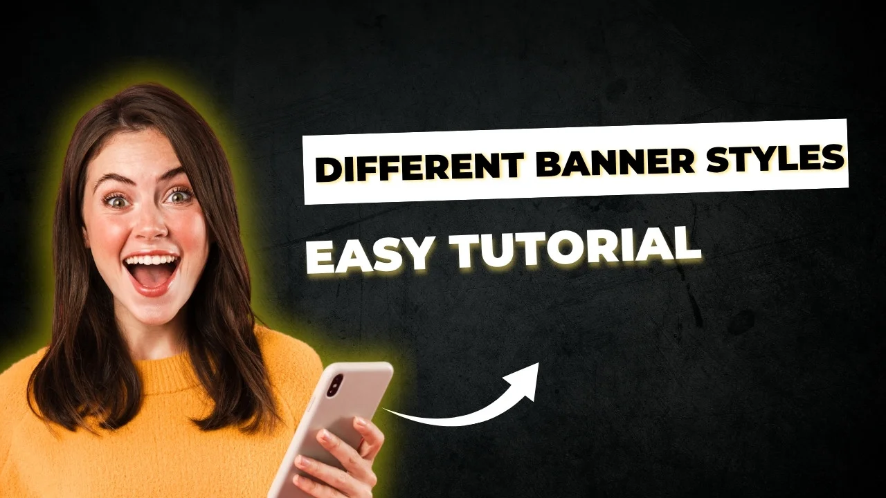
Design a Fantastic Elementor Hero Section That Really Connects to
When someone lands on your site, you only have a few seconds to catch their attention. If your hero section is unable to impress at that moment, the visitor simply rolls away or leaves. But if you get it – if your banner speaks to its emotions – one part can make a random visitor a loyal customer.
Let’s talk about how we do it, step by step – in a way that looks professional, feels huma,n and performs well on all devices.
What is a hero section and why it does matter
Think of a hero section as your digital handshake.
It’s the first thing people See headline, the background image, the call-to-action button.
It tells visitors, in seconds, what your brand stands for.
Why it’s so important:
- First impression counts: Most users decide within 3-5 seconds if they are to stay or leave.
- The brand’s message: This is where you are introducing your purpose clearly.
- Drive action: A strong CTA button (“Get started”, “Shop Now”, “Book A Call”) can guide visitors immediately.
👉 Personal Note: When I redesigned my website with a pure video background and a single CTA, the clicks increased by 42% in two weeks. Sometimes small design changes make huge differences.
Hero Section vs Banner – What is the real difference?
| Feature | Hero Section | Banner |
|---|---|---|
| Placement | Top of the page | Anywhere |
| Purpose | Capture attention, inspire action | Announce or promote something |
| Design | Full-screen, layered, interactive | Compact, simple |
| Content | Text + image/video + CTA | Mostly image + text |
💡 Think of a heroic section as your history opener, while a banner is just a headline
Design Principles That Actually Work
1. Keep It Focused
Your hero should express one clear message.
If you try to promote too many things at once, visitors lose focus.
2. Visually, who speaks
Use real brands or soft gradients – not stock images that feel robotic. Subtle movement or parallax can add life, but not exaggerate animations.
3. CTA that feels natural
A conversation-to-action is not just a button-it is an invitation. Test words like “exploring more”, “let’s begin” or “discover how” instead ofthe regular “click here“.
4. Above-the-Fold Design
Make sure key text and CTA are displayed before rolling.
This helps both user experience and SEO engagement measurements.
How to build a hero section in Elementor (step by step)
- Open your page in Elementor.
- Click “Add New Section” → Full Width.
- Set Height → Fits the screen.
- Add a wallpaper or video that represents your brand.
- Insert the heading, sub -heading and a CTA button.
- Fine adjustment of distance, typography, and movement effects.
🎨 Pro tips: Add a transparent gradient overlay – it improves the text readability and gives depth to your background.
Banner design that converts
If you create banners instead of full heroic sections, follow these ideas:
- Product banner: Focus on one offer – function, price, and a CTA.
- Sales Banner: Use bold writing and countdowns for urgency.
- Video Covers: Light animations can get immediate attention.
- Gradient Banner: Looks modern without distracting users.
🧠 Waseem Insight: Short and focused banners outperform busy ones — people prefer clarity over chaos.
Free Elementor Templates (and How to Use Them Right)
Elementor gives you several pre-built hero section templates, but don’t use them “as-is”.
A professional designer always adds a personal touch.
🔧 Quick adaptation tips:
- Change fonts and colors to match your brand.
- Replace the generic background with real images.
- Adjusting animations – subtle movement appears extra human and stylish.
Experience Tip: When I changed color assessment to a free template, it felt a hundred% custom – nobody guessed it got here from Elementor Library.
Elementor vs Gutenberg – which is better for hero sections?
| Feature | Elementor | Gutenberg |
|---|---|---|
| Ease of Use | Drag & drop visual editor | Block-based, less flexible |
| Animations | Built-in motion effects | Very limited |
| Templates | Dozens of ready layouts | Few default blocks |
| Customization | Full control | Restricted design options |
👉 If you care about aesthetics and smooth animations, Elementor clearly wins.
Mobile-friendly and speed optimization tips
A heroic section that looks good on the desk, but which breaks on mobile, is a disaster.
Follow these quick adjustments:
- Adjust text size for smaller screens.
- Use Elementor’s responsive settings to reposition elements.
- Compress big photos and videos.
- Keep the buttons finger -pleasant (minimum 44x44px).
- Test loading speed on both WiFi and 4G.
Pro Tip: Tools such as Tinypng or Shortpixel can reduce image size by up to 60% without losing quality.
Add a custom touch with code (optional)
Here’s a simple code-based hero section you could make modifications to:
<section class="hero-section">
  <div class="hero-content">
    <h1>Welcome to Your Brand</h1>
    <p>Design beautiful hero sections that connect instantly.</p>
    <a href="#services" class="cta-button">Get Started</a>
  </div>
</section>

<style>
.hero-section {
  background: url('hero.jpg') center/cover no-repeat;
  height: 100vh;
  display: flex;
  align-items: center;
  justify-content: center;
  color: white;
  text-align: center;
  position: relative;
}
.hero-section::after {
  content: '';
  position: absolute;
  inset: 0;
  background: rgba(0,0,0,0.5);
}
.cta-button {
  background: #ff5a5f;
  padding: 12px 24px;
  border-radius: 6px;
  color: #fff;
  font-weight: 600;
  text-decoration: none;
  transition: background 0.3s;
}
.cta-button:hover {
  background: #e04b4f;
}
</style>
👨💻 Why it works: The overlay adds clarity, while centered content makes it instantly readable.
You can easily change the background image or change the colors to fit your brand palette.
SEO and Internal Linking Tactics
Don’t leave your hero class alone.
Connect it to related training programs such as:
- Elementor Header Design
- Landing Page design
- Template Create
This helps users find more content and increases your stay time on the site – a signal that Google values highly.
Question to ask
Q1. Can I create a hero segment with Elementor Free?
Yes surely. You can lay out an easy version of the usage of background pix and textual content. For animations and effects, upgrade to Pro.
Q2. How do I do the banner for my responsive?
Use Elementor’s preview of devices and adjust padding, margins, and font size for tablets and mobiles.
Q3. What is the best image size for hero sections?
Compressed to under 400KB, use approximately 1920×1080 px.
Q4. Can I add a video background?
Yes, Elementor supports MP4 and YouTube backgrounds – just make sure the videos are short and optimized for speed.
Final Words
Your hero phase is not just a design — it’s your brand’s voice.
When you combine clarity, emotion, and velocity optimization, traffic feels the difference.
Experiment with coloration, movement, and tone until your homepage appears like you.
Waseem Advice: Always take a look at designs on a cell, ask a pal for comments, and keep enhancing. Small updates could make your website unforgettable.

I visit everyday a few blogs and websites to
read content, however this website provides quality based articles.