
Shape Divider Elementor: How to Make Your Website Sections Look Amazing
Okay, let me start with something you’ll relate to. Imagine you’re building a website using Elementor. You’ve picked the colors, added images, written all your content, but… the page still feels kind of flat. I’ve been there too. Honestly, it frustrated me a lot when I first started. That’s when I discovered Shape Dividers in Elementor, and trust me, it’s one of those small tricks that makes a big difference.
So today, I’m going to explain it like I would to a student sitting right in front of me—step by step, with little tips that most tutorials don’t even mention.
What Exactly is a Shape Divider?
Think of a Shape Divider like a little visual handshake between sections. Instead of just having a plain line or nothing at all, it gives your section a natural break. You can put it at the top or bottom of any section.
There are different types—waves, curves, tilts, triangles. Personally, I like starting simple. I remember using a huge, complicated wave once, and it completely messed up the spacing on mobile. Lesson learned: sometimes a small, subtle curve looks way more professional.
Where Should You Use Them?
Here’s the thing: Shape Dividers aren’t just for making things look pretty. They actually guide the visitor’s eyes and help them focus on the important stuff.
- Highlight Sections: Like testimonials. A small curve on top signals, “Hey, look here—it’s special content.”
- Smooth Transitions: Nobody likes jumping from one flat section to another. Dividers make scrolling feel… smoother.
- Brand Cohesion: Match the divider color with your brand palette—it makes everything feel tied together.
- Engagement: Pages that look dynamic make people scroll more. Believe me, I’ve seen it work on multiple sites.
Here’s a tip most tutorials skip: try using a subtle SVG divider over a gradient background. It creates the illusion of depth without slowing down your page. It’s something you’ll notice subconsciously, but it makes your website feel alive.
Top or Bottom Divider—Which One to Pick?
I get asked this all the time: “Should I use it on top, bottom, or both?” My answer—depends, but here’s a simple guide:
- Top Divider: Perfect to introduce a new section. Imagine your “Services” section following “About Us.” A wave on top gently ushers the visitor in.
- Bottom Divider: Good for ending a section and pointing to the next one.
Tip from experience: using both top and bottom is fine if you’re careful. Too many shapes can make your page feel chaotic.
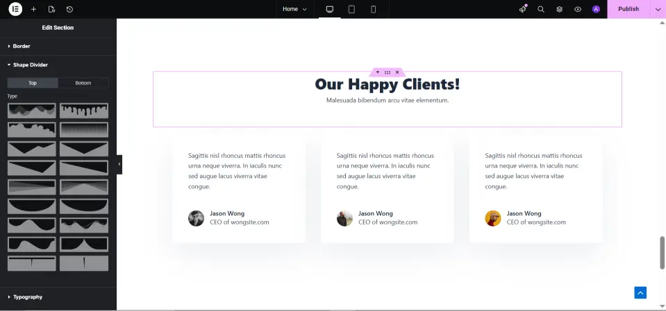
The Types of Shape Dividers
Here’s what I tell my students: different shapes have different “personalities.”
- Wave: Smooth, flowing, creative—great for modern websites.
- Curve: Friendly, round—perfect for blogs or community pages.
- Tilt: Bold angles—portfolio or tech websites love this.
- Triangle: Sharp, minimal—corporate and geometric designs.
Quick teacher note: pair dividers with gradients or background images. Even subtle motion adds a professional touch.
Mobile-Friendly Tips
This is where beginners mess up. What looks perfect on a desktop can break on mobile. Always take a look at:
- Height & Width: Make positive dividers so they don’t cover headings or buttons.
- Orientation: Waves or tilts may additionally need flipping on smaller screens.
- Consistency: Keep your design neat across devices.
True story: I once had a wave swallow my “Sign Up” button on mobile. Spent 30 minutes figuring it out. Small tweaks like this save a lot of headaches.
Common Mistakes I’ve Seen
Even people with experience slip here:
- Text Overlap: Always check spacing around headings and buttons.
- Too Many Dividers: One in line with the section is generally sufficient.
- Ignoring Mobile: Desktop-most effective questioning ruins the experience.
- Clashing Colors: Make certain dividers fit your segment colorings.
Avoid these, and your site will look polished without overthinking.
Adding a Shape Divider (Step by Step)
Here’s how I show students:
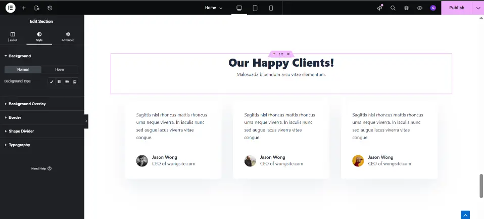
- Click Edit Section.
- Go to Style → Shape Divider.
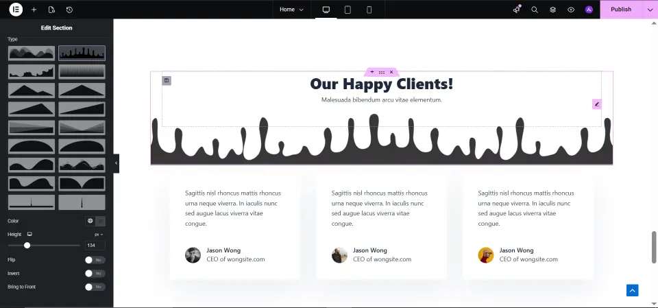
- Choose Top or Bottom, then pick a shape.
- Adjust height, width, and color.
- Preview on desktop, tablet, and mobile.
Tip: slightly reduce the divider’s height on mobile. Tiny change, but it makes a huge difference.
Quick Comparison
| Divider Type | Best For | Tip |
|---|---|---|
| Wave | Creative sites | Pair with gradient |
| Curve | Blogs/community | Soft curves above testimonials |
| Tilt | Portfolios/tech | Angles for modern look |
| Triangle | Corporate sites | Minimal geometric feel |
FAQs
Q1: Can I use more than one divider on one web page?
Yes, but don’t overdo it. Too many make the web page messy.
Q2: Will dividers gradually go down my website?
No, so long as you use SVG shapes. They’re light-weight.
Q3: Are they cell-friendly?
Yes, simply take a look at and tweak for smaller monitors.
Q4: Can they be animated?
Absolutely. Subtle motion draws attention without hurting speed.